
A project team may need hundreds of data points to manage execution. An executive usually does not. That difference is where many project dashboards fail.
They take the same information used by the Project Manager — schedule detail, risks, actions, budget lines, milestones, status updates — and compress it into a smaller screen. The result looks cleaner. But it is still a project report.
An executive project dashboard has a different job. It should answer, quickly:
- Is the project still likely to deliver what matters?
- What changed since the last review?
- What is getting worse?
- Where is management attention required?
- Which decision cannot be made by the project team?
- What happens if leadership does nothing?
The difference is not primarily visual. It is a difference in decision level. PMI guidance on effective status reporting emphasizes that reporting has to be targeted to its audience, concise enough that decision-makers will actually use it, and structured so it directs them toward the information that requires attention. That is the starting point for an executive project dashboard.
An executive dashboard is not a smaller project dashboard
A standard project dashboard helps a Project Manager or PMO understand project state, deviation, trend and required action. The executive layer sits one level above that.
The Project Manager may need to know:
- which task moved;
- why a milestone slipped;
- which risk mitigation is late;
- how much contingency remains;
- which supplier action is overdue.
The executive usually needs to know:
- whether the milestone now threatens a strategic commitment;
- whether additional funding or scope trade-offs are required;
- whether an unresolved dependency requires escalation;
- whether the expected benefit is still achievable;
- whether a decision is required today.
This is why simply removing rows from a project report does not create an executive dashboard. The information has to be reframed around executive decisions.
Start with the decisions, not the KPIs
A common dashboard-design sequence is:
- collect available data;
- choose KPIs;
- create charts;
- add RAG status;
- present the result to management.
For executive reporting, the sequence should usually run in the opposite direction. Start by asking:
What decisions might this executive need to make about this project? Then determine what signals are required to support those decisions.
Typical executive decisions include:
- approve additional budget;
- accept or reject a scope trade-off;
- escalate a supplier or partner issue;
- reallocate resources;
- change a strategic milestone;
- accept additional risk;
- stop or delay an initiative;
- resolve a cross-functional dependency.
Only then should you decide which information belongs on the dashboard. This prevents the dashboard from becoming a catalogue of metrics that are interesting but not actionable.
The five questions an executive dashboard should answer
1. Are we still on track?
Not Schedule = Amber, but: Amber — launch remains achievable, but only if supplier validation closes by 18 September. The first statement describes status. The second explains the management condition behind that status. An executive should not have to interpret a colour without context.
A useful overall-health statement therefore combines status + reason + consequence.
| Status | Weak version | Executive version |
|---|---|---|
| Green | Project on track | Green — launch date remains achievable with current contingency |
| Amber | Schedule at risk | Amber — two-week supplier delay has consumed most schedule contingency |
| Red | Project delayed | Red — committed launch cannot be maintained without a scope or resource decision |
RAG remains useful, but it should be the entry point, not the conclusion.
2. What changed?
An executive dashboard should never force the reader to compare today's numbers mentally with last month's presentation. Changes should be explicit.
| Signal | Previous | Current | Direction |
|---|---|---|---|
| Forecast completion | 30 Nov | 14 Dec | worsening |
| Cost forecast | €4.8m | €5.1m | worsening |
| Critical risks | 2 | 4 | worsening |
| Decisions overdue | 0 | 3 | worsening |
The key question is not only Where are we? It is What is moving? A project that is amber and improving may require less executive attention than a project that is green but deteriorating rapidly.
This is where the project monitoring layer becomes important. Monitoring identifies the changes and weak signals. The executive dashboard determines which of those changes matter at management level.
3. What could become critical next?
Executives should not see only problems that have already happened. The dashboard should also surface conditions that threaten future outcomes:
- schedule contingency falling below a meaningful threshold;
- repeated forecast deterioration;
- a growing unresolved decision backlog;
- increasing dependency uncertainty;
- a weakening benefits forecast;
- cost commitments rising faster than actual spend;
- several risks converging on the same milestone.
Consider a project where the overall status, the milestone and the budget are all green. That looks reassuring — until you add that supplier validation slipped twice, schedule contingency fell from 28 to 8 days, and a design decision is 11 days overdue. The executive interpretation changes immediately. No KPI necessarily needs to be red for the management risk to be real.
An effective executive dashboard should therefore include a small early-warning block, not just current RAG indicators.
4. What decision is required?
This may be the most valuable section on the entire dashboard.
| Decision required | Owner | Needed by | Why it matters | Consequence of delay |
|---|---|---|---|---|
| Approve supplier B | COO | 8 Sep | Supplier A cannot recover the committed date | +3 weeks schedule exposure |
| Release €250k contingency | CFO | 12 Sep | Recovery activity cannot start | Launch recovery delayed |
| Accept reduced phase-1 scope | Sponsor | 15 Sep | Full scope incompatible with current launch | Launch date at risk |
A dashboard that surfaces problems without clarifying the decision required still leaves management work unfinished. The useful chain is signal → consequence → decision → deadline, not simply signal → red indicator.
5. What happens if we do nothing?
Every important executive issue should include an explicit consequence. Supplier delay — Amber is weak. Supplier delay — Amber — validation now 12 days late is better. The executive version is: Supplier validation 12 days late. If unresolved by 8 September, launch contingency falls below five working days. Decision required: approve alternate supplier.
This forces project reporting to connect operational information with management consequences. Not every issue requires executive action — some should remain with the project team. The dashboard should help distinguish the two.
What belongs on an executive project dashboard?
A useful structure fits into six blocks.
1. Overall project health
Show the overall RAG, a one-sentence rationale, and the trajectory: improving, stable or worsening. For example: Amber — launch remains feasible, but supplier recovery and two overdue decisions have reduced schedule contingency to eight working days. Trend: worsening.
2. Strategic outcomes and milestones
Do not reproduce the entire schedule.
| Milestone | Baseline | Forecast | Status | Executive significance |
|---|---|---|---|---|
| Design freeze | 20 Sep | 26 Sep | Amber | Gates supplier tooling |
| Production validation | 18 Oct | 31 Oct | Red | Threatens launch readiness |
| Market launch | 15 Dec | 15 Dec | Green | Contingency nearly exhausted |
3. Budget and forecast
Show more than actual spend. Useful fields include approved budget, actual, committed, forecast at completion, variance and trend. Actual spend tells you what has already happened; forecast tells you where the project appears to be going.
4. Top risks, issues and dependencies
Do not show the full risk register. Show only items that threaten a strategic outcome, require cross-functional action, exceed project-level authority, or are deteriorating significantly.
| Item | Exposure | Trend | Mitigation confidence | Executive action |
|---|---|---|---|---|
| Supplier capacity | High | worsening | Low | escalation required |
| Regulatory approval | Medium | stable | High | monitor |
| Resource conflict | High | worsening | Medium | prioritization decision |
5. Decisions required
This deserves a dedicated block — not a note at the bottom, and not a bullet hidden inside risks.
6. Outlook
Finish with the forward-looking management view. For example: Current forecast: launch still achievable. Confidence: medium. Main assumption: supplier validation completed by 18 September. Next trigger: if validation slips beyond that date, the launch forecast moves by approximately three weeks.
What this looks like in ControlRoom
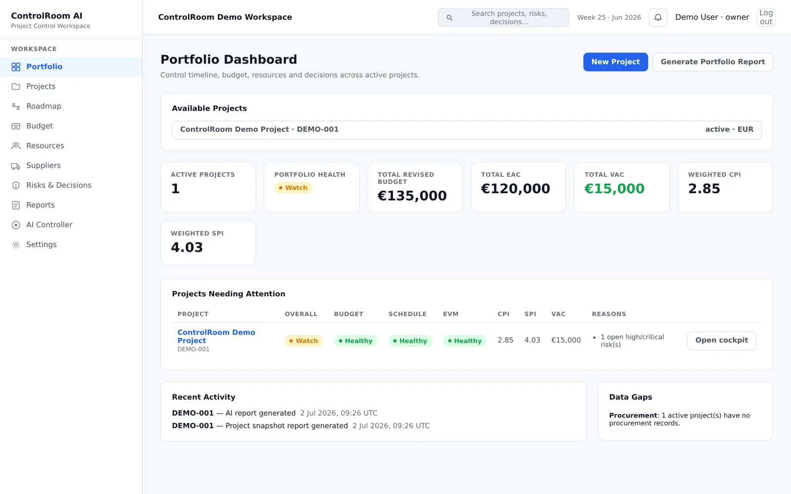
In ControlRoom's Free plan today, this discipline applies to one project at a time: the cockpit shows budget deviations, blocked tasks and declared missing data instead of a comfortable average. A multi-project view with aggregate KPIs is on the roadmap, not available today.
A practical executive project dashboard example
The figures below are illustrative and do not describe a real project.
Overall health
Amber — worsening. Launch remains achievable, but supplier recovery and pending design decisions have reduced schedule contingency from 24 to 8 working days.
| Milestone | Status | Trend | Forecast |
|---|---|---|---|
| Design freeze | Amber | worsening | +6 days |
| Validation | Amber | worsening | +9 days |
| Launch | Green | stable | On baseline |
| Budget | Actual | Committed | Forecast | Variance |
|---|---|---|---|---|
| €5.0m | €3.4m | €4.7m | €5.3m | +€0.3m |
Early warnings
- schedule contingency: 24 → 8 days;
- supplier confidence: declining;
- three design decisions overdue;
- forecast cost increased for two consecutive reporting periods.
| Decision | Needed by | Consequence |
|---|---|---|
| Approve alternate supplier | 8 Sep | avoids additional schedule exposure |
| Release contingency budget | 12 Sep | enables recovery plan |
| Confirm phase-1 scope | 15 Sep | protects launch commitment |
Outlook
Launch remains technically achievable, but current recovery assumptions require two executive decisions within the next reporting period.
Notice what is missing: the complete Gantt chart, all open actions, the full risk register, task completion percentages, dozens of KPIs, historical commentary. Those details may still exist. They simply do not belong in the first executive view.
Executive dashboard vs project dashboard
| Project dashboard | Executive project dashboard |
|---|---|
| Supports project control | Supports management decisions |
| Used mainly by PM / PMO / team | Used by sponsor / executive / steering committee |
| Shows operational deviations | Shows consequences of important deviations |
| Can contain more execution detail | Ruthlessly filters detail |
| Answers “what is happening?” | Answers “where do I need to intervene?” |
| Tracks actions | Highlights decisions |
| Explains project performance | Connects performance to business outcomes |
A strong reporting architecture often works as a hierarchy. Each layer removes detail while adding interpretation.
Common executive dashboard mistakes
Showing too many KPIs
More metrics do not automatically create more visibility. The relevant test is: could a meaningful change in this metric alter an executive decision? If not, it probably belongs one level lower.
Using RAG without explanation
Every non-green status should explain why + impact + required response.
Reporting the past but not the forecast
Executives need to understand expected outcomes, not simply historical performance. Show forecast completion, expected cost, expected outcome where relevant, and confidence or key assumptions.
Hiding decisions inside risks
A risk may be informative. A decision is actionable. Keep them separate.
Making everything an executive problem
Only surface matters that exceed delegated authority, threaten important outcomes, require prioritization or require leadership intervention.
Replacing evidence with narrative
“The team remains confident” is weaker than “Launch remains forecast for 15 December, but schedule contingency has fallen from 24 to 8 working days.” The second statement gives management something verifiable.
The 30-second executive dashboard test
After 30 seconds, the reader should be able to answer:
- Is this project healthy?
- Is it getting better or worse?
- What threatens the expected outcome?
- Which issue matters most?
- Is an executive decision required?
- By when?
- What happens if no action is taken?
If the answers require opening another spreadsheet or asking the Project Manager to explain the dashboard, the executive layer is incomplete. The dashboard should not eliminate discussion. It should make the right discussion obvious.
An executive review should make the situation clear at the level of the people taking part in the discussion. The first view should provide a concise summary, with supporting evidence and operational detail available for follow-up. Tailor the format to its audience and to the discussion at hand, so the review stays focused while still allowing more specific questions.
Sources
- PMI — Anatomy of an effective status report — status reporting should be targeted to its audience, concise enough for decision-makers to use, and structured to direct attention to what matters, with a summary first and detail on demand.